Showing posts with label Brief 1 (Narrative Image). Show all posts

11.12.10

Vector designed book covers

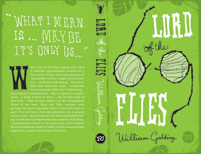
I have included these book designs on my context blog because I think they are a good example of how effective a good colour pallet can be. Even on very simple imagery.


I like the mix of repetitive circles amongst the messy paint splashes and the contrasting orange and blue palette are a grate use of colour.

9.12.10

Grate posters


These bold vector designs are lovely the designer has incorporated the shape of ballerina and swan beautifully.

26.11.10

Photography collage design


Some grate cover designs

I have found a few cover designs using animal illustration. The tiger one below is my favorite! Grate symbolism and clever use of the new york skyscrapers as the teeth.
Chronic City, Uk edition, designed by Miriam Rosenbloon

The Death of Bunny Munro, design by Charlotte Strick: "An evil bratty bunny!

The Bedside Book of Beasts, design by CS Richardson:
Never smile at a monkey: And 17 Ohther important things to remember, design by Scott Magoon, illustration by Steve Jenkins
I think this is a good design even though it kind of scars me

Before I die By Jenny Downham

Although 'Life of Pi' has an adult author it is actually narrated by a young boy, I think it is important to communicate this on the front cover. So I have been researching front covers designed with this similar childish look I'm hoping to communicate.

I have found these designs by Jenny Downham for the novel 'Before I die'

" ... When you read the final pages of Jenny Downham's debut novel through tears, don't say you weren't warned. Before I Die is narrated by a perceptive, witty 16-year-old called Tessa Scott. Tessa has been living with leukaemia for four years. And, by the end of the book, she will die. There's no use fighting this. It tells you right there in the title.
Even with this foreknowledge, it's hard not to feel a stab of resentment as you're confronted by something as sentimentally sucker-punching as Before I Die. This much-hyped novel is destined to drive hundreds of thousands of readers to tears and to swift injunctions to all their friends to read it.


This imagery and in particular use of colour demonstrates well the dark, depressing content of the novel. The top design was used as the final product I think this was a good decision because the style of font and watercolor imagery provides the child tone.
This could be a possible design direction I take for my cover design.
Although I think for clarity the second design down would provide a better background for the type and title of the book. The red type on the final design is bit lost in the green watercolour background.

20.10.10

Life of Pi Plot reminder

This is a very short summery of what happens through the novel but it has reminded me of the basics.

Life of Pi is divided into three parts. In the first, the main character, Pi, an adult, reminisces about his childhood. Piscine Molitor Patel ("Pi") was named after a swimming pool. He changes his name to Pi when he began to attend secondary school, because he was tired of being mistakenly called "Pissing Patel." His parents own a zoo. Pi was born a Hindu, but as the fourteen-year-old is introduced to Christianity and Islam, he starts to follow three religions. He tries to understand God through the lens of each religion and comes to recognize the benefits of each. Eventually, his family decides to move to Canada for political concerns.

In the second part, the boat to Canada carrying Pi's family and most of the animals in their zoo sinks! Pi ends up with a Bengal tiger named Richard Parker, a hyena, a zebra, and an orang-utan named Orange Juice in a small lifeboat. The other humans and animals on the boat drown. The hyena tears off the zebra's leg and spends the next several days eating the zebra bit by bit. The hungry hyena kills "Orange Juice", despite her not being a natural prey of the hyena. Richard Parker eats the hyena because he was also hungry. Pi is left as the only other survivor. Pi finds food and water supplies on the boat, but as they grow scarce, Pi begins fishing for himself and Richard Parker, whom he keeps fed so Richard Parker will not seek to eat him. Pi also wants to keep Richard Parker alive because he wishes not to be left in solitude on the ocean. Pi ensures, with his knowledge as the son of a zoo-keeper, that Richard Parker considers Pi the alpha animal and therefore refrains from attacking the him. Pi manages to stay alive for 227 days, often half in delusion with thirst and hunger. The lifeboat reaches the coast of Mexico.

The third part is a conversation between two officials from the Japanese maritime department. They seek to ascertain why the ship sunk, so they interview Pi, but they do not believe him. Pi tells another story, in which the orang-utan is his mother, the zebra is a sailor with a broken leg, and the hyena is a cook who killed Pi's mother and ate the sailor. Richard Parker is Pi himself. Pi asks the officials which of the two stories they prefer. They say the story with the animals.

12.10.10

These three printed posters are grate examples of how effectively you can create a poster with duo tone and monotone. Even with a limited colour palette you can still create an effective clear poster.


Vintage style posters


Poster to title sequence

For this Narrative project, I am also considering the visual relation of the poster designs and the title sequence. "I am not crazy about war movies, but this is another amazing mix of drawing and pictures done by "The art of the title sequence" team."

Screen printed Movie poster

I like this striking movie poster. The unusual choice of screen printing has enabled the designer to create this poster out of two bold colours, red and blue. I also like the use of layering to over lap the two colors slightly and create a deep purple as depth to the image. This printing process is also a means of reproducing many more copies with the same hand crafted look and quality.


MARCUS WALTERS, UK
“I chose Spirited Away, a film I have watched many times. The image was drawn partly from my own memories of the film and used simple paper cut outs to construct the silhoutted iconic images. The use of red and blue depict the central characters costume and the water featured throughout the film both of which are applied in water-based ink eluding to the dreamlike narrative of the story.”

Vector Movie Posters


I found these movie poster designs on the behance website. I like the designers use of detailed vector portraits as the main illustration. The modern typeface and use of colour bring the posters up to date, while keeping a small sense of each film (genera, character, tone etc).
Although I like these posters, they remind me more of experimental CD cover design or gig/concert promotion. Not a strong editorial interpretation of each films content.

6.10.10

Creative publishing

For this creative publishing brief I have been researching how hand drawn imagery can be used combined with vector graphics.

The book box set below has a lovely hand crafted quality. Although each book is different they have all been designed in a similar way so they all visually come together as a set. The colour palette, layout and image quality are continuos.


Sea of Poppies creative publishing


While searching for inspiration on my creative publishing project, I came across this cover design for the book 'Sea of poppies' this design also relates to my design for pattern brief.
Designed by Stephen Johnston, the imagery is taken from vintage art which works alongside the calligraphy pen typeface.
The story is the first in a trilogy of epic historical sagas, opening in India 1840's. The look of the cover keeps a traditional classic feel of that time period. However the bright flat colours of the poppies and waves keep the design fresh with a modern graphic look.

MOON (Film Poster Campaign)


I like this style of poster and combination of vector and hand drawn imagery. The smooth, angular, vector shapes add to the technical 'space' theme. This contrasts with the detailed, hand drawn, worried expression on the characters face. The simple colour palette of cold blues and white also add to this space theme and tone of poster.
Designer Kevin Tong
“I really wanted to make my poster ambiguous, to make all the elements run together, to show how they are all part of a larger purpose, with Sam Bell being the central figure, almost ghosted into the physical world of the space station.”

30.9.10

Another Year (film promotion)


"The title treatment appears to have grown. As the letters and branches intertwine we also get across the four seasons with the use of colour. The tree is divided into the four seasons – spring at the bottom, with new leaves and flowers on the branches, summer next, then autumn with brown and orange leaves, fading into winter at the top with bare branches. It needed a human element, thus the shovel and fork symbolise a relationship between two people." from web site