12.10.10

Monochrome pattern

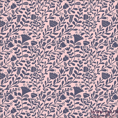
These patterns were used for branding identity and collateral design. I have included them in to my research because they are a good example of how I hope to use vector imagery and layout to create wrapping paper.
An interesting repetitive pattern made up of vectors to work on different scales.


Vector Movie Posters


I found these movie poster designs on the behance website. I like the designers use of detailed vector portraits as the main illustration. The modern typeface and use of colour bring the posters up to date, while keeping a small sense of each film (genera, character, tone etc).
Although I like these posters, they remind me more of experimental CD cover design or gig/concert promotion. Not a strong editorial interpretation of each films content.

11.10.10

Animal prints


These illustrations demonstrate how I could combined hand draw and vector image by using layered print. A bold vectorized geometric pattern in the background, adds colour and depth. The monochrome, hand drawn animals printed on top are positioned to interact with the below image. I can see these images working well as modern t-shirt print designs.

6.10.10

British Books

As part of the Urban Outfitters brief I need to find out which British books are popular with 18-30 year olds. From my findings I need to select a few for myself to read and generate imagery and illustration from. I am currently writing up a questioner to gather relevant titles.

Urban outffitters


To get started on this urban Outfitters brief I have visited their Leeds branch to research their shop environment. Selling a range of on trend products, mainly clothing, they take pride with their vintage, retro, hipster, kitschy style. A popular shop with students.
They sell a few books and some of their clothing garments also contain influences from literature. So my british book themed banners should work well alongside these items.

Creative publishing

For this creative publishing brief I have been researching how hand drawn imagery can be used combined with vector graphics.

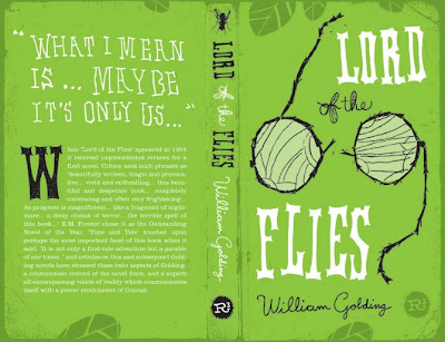
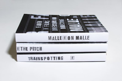
The book box set below has a lovely hand crafted quality. Although each book is different they have all been designed in a similar way so they all visually come together as a set. The colour palette, layout and image quality are continuos.


Sea of Poppies creative publishing


While searching for inspiration on my creative publishing project, I came across this cover design for the book 'Sea of poppies' this design also relates to my design for pattern brief.
Designed by Stephen Johnston, the imagery is taken from vintage art which works alongside the calligraphy pen typeface.
The story is the first in a trilogy of epic historical sagas, opening in India 1840's. The look of the cover keeps a traditional classic feel of that time period. However the bright flat colours of the poppies and waves keep the design fresh with a modern graphic look.

MOON (Film Poster Campaign)


I like this style of poster and combination of vector and hand drawn imagery. The smooth, angular, vector shapes add to the technical 'space' theme. This contrasts with the detailed, hand drawn, worried expression on the characters face. The simple colour palette of cold blues and white also add to this space theme and tone of poster.
Designer Kevin Tong
“I really wanted to make my poster ambiguous, to make all the elements run together, to show how they are all part of a larger purpose, with Sam Bell being the central figure, almost ghosted into the physical world of the space station.”

Design for pattern


At the moment I want to practice design for pattern using vector image. So I have chosen to answer a wrapping paper design brief. With this in mind I have researched patterns produced by designers with this similar vector design practice.
The owl design above represents how, using vectors the image can be easily reproduced and modified, in this case a colour change of blue and pink.
I really like the intricate detail in the below designs as well. The design has managed to keep the hand drawn quality through out.


5.10.10

Graphic T-Shirts

To start the printed tee's brief I needed to familiarize myself with All Saints clothing. So I have visited their store and viewed their website. Here are a few examples of the types of illustration they currently use to print onto their clothing. I like the "grunge", hand crafted quality and intend to continue this style into my images.


30.9.10

Another Year (film promotion)


"The title treatment appears to have grown. As the letters and branches intertwine we also get across the four seasons with the use of colour. The tree is divided into the four seasons – spring at the bottom, with new leaves and flowers on the branches, summer next, then autumn with brown and orange leaves, fading into winter at the top with bare branches. It needed a human element, thus the shovel and fork symbolise a relationship between two people." from web site
Start of the third year

To start this final year I have written a set of briefs and selected 4 to work on up to christmas. Through this blog will be the documentation of research and development of these four projects.