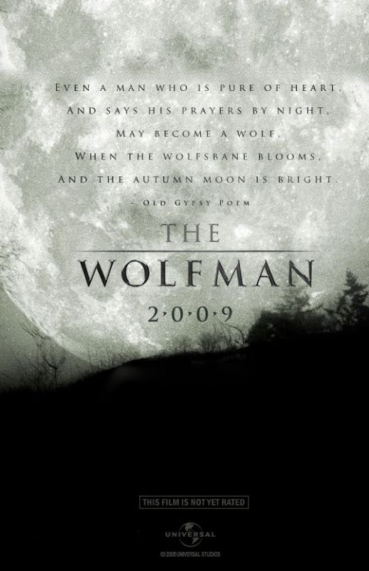
This poster is a good example to show how type and layout are used to put an image into context. In this case the gothic 'tombstone' look of the title and dotes between the year (2.0.0.9) draw attention to the full moon in the background, classic werwolf association.
The grey 'dabbled' textured look of the moon appears as stone, reenforcing the tombstone look of the type.
Motion blur


I have noticed that motion blurs have been added to the posters, in either the imagery or the title, probably used to add a ghostly/horror element. But i think also indicates a faced pace, action to the film.


 I think these Wolfman posters are grate!
The gripping and atmospheric imagery alone, is enough to give the viewer a clear indication as to what type of movie this is. The typeface used (i think 'Century Gothic'), is quite simple compered to usual horror posters. I think this is a good design decision as the type is used just to inform and not compete with the imagery for the viewers attention.
The layouts work well too. The imagery creates negative black space, a good background for the contrasting white type.
No comments:
Post a Comment