26.11.10

Before I die By Jenny Downham

Although 'Life of Pi' has an adult author it is actually narrated by a young boy, I think it is important to communicate this on the front cover. So I have been researching front covers designed with this similar childish look I'm hoping to communicate.

I have found these designs by Jenny Downham for the novel 'Before I die'

" ... When you read the final pages of Jenny Downham's debut novel through tears, don't say you weren't warned. Before I Die is narrated by a perceptive, witty 16-year-old called Tessa Scott. Tessa has been living with leukaemia for four years. And, by the end of the book, she will die. There's no use fighting this. It tells you right there in the title.
Even with this foreknowledge, it's hard not to feel a stab of resentment as you're confronted by something as sentimentally sucker-punching as Before I Die. This much-hyped novel is destined to drive hundreds of thousands of readers to tears and to swift injunctions to all their friends to read it.


This imagery and in particular use of colour demonstrates well the dark, depressing content of the novel. The top design was used as the final product I think this was a good decision because the style of font and watercolor imagery provides the child tone.
This could be a possible design direction I take for my cover design.
Although I think for clarity the second design down would provide a better background for the type and title of the book. The red type on the final design is bit lost in the green watercolour background.

24.11.10

ROA Graphic artist


This graphic artist illustrates in a similar style to me. However i don't understand the context of his work. Perhaps he's trying to show what effects the urban environment has on nature? or it's just a bit of creative graffiti. His use of surface shape and texture to direct the illustration is clever, particularly the top image.

14.11.10

Creepy Nightclub flyer designs

I have been looking at other nightclub flyers containing a similar halloween theme to my brief. This example below reminds me of the 'corps bride' photograph I took. The use of spot colour pink adds a bold focus to the picture.
I think using single spots of colour is quite an interesting technique to add focus.


Photography


11.11.10

Horror type research


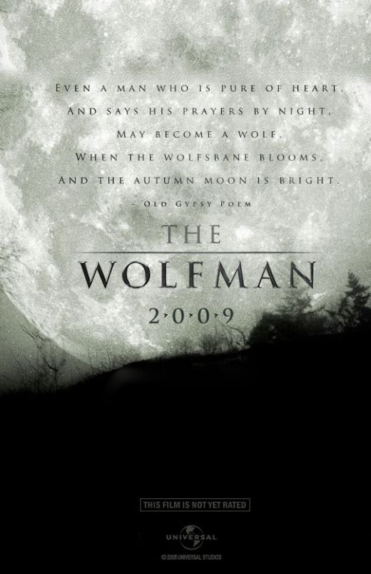
This poster is a good example to show how type and layout are used to put an image into context. In this case the gothic 'tombstone' look of the title and dotes between the year (2.0.0.9) draw attention to the full moon in the background, classic werwolf association.
The grey 'dabbled' textured look of the moon appears as stone, reenforcing the tombstone look of the type.

Motion blur

I have noticed that motion blurs have been added to the posters, in either the imagery or the title, probably used to add a ghostly/horror element. But i think also indicates a faced pace, action to the film.


I think these Wolfman posters are grate!
The gripping and atmospheric imagery alone, is enough to give the viewer a clear indication as to what type of movie this is. The typeface used (i think 'Century Gothic'), is quite simple compered to usual horror posters. I think this is a good design decision as the type is used just to inform and not compete with the imagery for the viewers attention.
The layouts work well too. The imagery creates negative black space, a good background for the contrasting white type.

7.11.10

Layered Photography minipulation


Produced for the fashion industry, these images demonstrate how you can create a surreal photo manipulation. Using layers and photo filters in Photoshop. The contrasting, intense blue and red help distinguish between the animal form and model.
I think this effect is interesting and provides an alternative look that would work well on thehalloween nightclub flyer brief.


5.11.10

Lucky Kitchen

Speaking to Joe yesterday he mentioned my work is similar to 'Lucky Kitchen' and I should check out their website for inspiration and ideas.
I have been on their website, they are a studio who design for record labels. Like me they hand draw illustrative pattern. Some of it is quite interesting and decorative, which I think suite the type of 'calming' music being advertised. However, like me I think they also struggle with colour combinations.


20.10.10

Life of Pi Plot reminder

This is a very short summery of what happens through the novel but it has reminded me of the basics.

Life of Pi is divided into three parts. In the first, the main character, Pi, an adult, reminisces about his childhood. Piscine Molitor Patel ("Pi") was named after a swimming pool. He changes his name to Pi when he began to attend secondary school, because he was tired of being mistakenly called "Pissing Patel." His parents own a zoo. Pi was born a Hindu, but as the fourteen-year-old is introduced to Christianity and Islam, he starts to follow three religions. He tries to understand God through the lens of each religion and comes to recognize the benefits of each. Eventually, his family decides to move to Canada for political concerns.

In the second part, the boat to Canada carrying Pi's family and most of the animals in their zoo sinks! Pi ends up with a Bengal tiger named Richard Parker, a hyena, a zebra, and an orang-utan named Orange Juice in a small lifeboat. The other humans and animals on the boat drown. The hyena tears off the zebra's leg and spends the next several days eating the zebra bit by bit. The hungry hyena kills "Orange Juice", despite her not being a natural prey of the hyena. Richard Parker eats the hyena because he was also hungry. Pi is left as the only other survivor. Pi finds food and water supplies on the boat, but as they grow scarce, Pi begins fishing for himself and Richard Parker, whom he keeps fed so Richard Parker will not seek to eat him. Pi also wants to keep Richard Parker alive because he wishes not to be left in solitude on the ocean. Pi ensures, with his knowledge as the son of a zoo-keeper, that Richard Parker considers Pi the alpha animal and therefore refrains from attacking the him. Pi manages to stay alive for 227 days, often half in delusion with thirst and hunger. The lifeboat reaches the coast of Mexico.

The third part is a conversation between two officials from the Japanese maritime department. They seek to ascertain why the ship sunk, so they interview Pi, but they do not believe him. Pi tells another story, in which the orang-utan is his mother, the zebra is a sailor with a broken leg, and the hyena is a cook who killed Pi's mother and ate the sailor. Richard Parker is Pi himself. Pi asks the officials which of the two stories they prefer. They say the story with the animals.

18.10.10

Julian Gallash - Ballpoint illustration

I find these illustrations very striking, the ballpoint pen provides an interesting tone of colour along with a high attention to detail. I also like the added splash of bold, vivid colours and repetitive pattern.


The REAL Christmas colour spectrum.

I've been looking into different colour palettes I could use for the Chrismas themed wrapping paper. Wanting to stay away from the obvious (red, green, gold) I came across this fun colour spectrum made up of the 'real' colours of Christmas.
From a competition on the www.boooom website each colour chip has been sent with its own personal meaning and here are the best.


14.10.10

Retail Promotions and branding

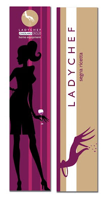
Although I don't particularly like this design, I have included this onto my blog to show an example of how a banner design can be applied through out a shop environment. Then further on to bag design, tag labels, vouchers and other relating promotions. This is how I can see my Urban Outfitters brief developing further.


Garry Milne


Spoke to Ollie this morning, after viewing some of the stuff on my blog he recommended I look at the work of Garry Milne.
His imagery is very similar to the hand drawn prints I've been looking at, however they are produced using vectors. In this case they have been applied to a calendar however I think they could also make an interesting t-shirt print.